
25.02.2026
SAP Analytics Cloud Q1 2026
SAP Analytics Cloud (SAC) is the central tool for planning, analysis, and business intelligence in the SAP world. With the fourth quarterly release (Q4) 2025, SAP is once again delivering a comprehensive update that takes the platform's integration, user-friendliness, and governance to a new level.
As BDF experts and specialists in the financial supply chain with SAP, we know that every release has the potential to optimize your business processes. We have analyzed the official release notes and present the five most important new features that you should know about and include in your analytics roadmap.
The SAP Analytics Cloud (SAC) update for the first quarter of 2026 includes several functional enhancements that are primarily aimed at increasing reporting efficiency and deeper system integration. The focus is on optimizing administrative processes, expanded visualization options, and improved handling of metrics and comments.

1. Game changer: Native story versioning
The absolute highlight of this update is the introduction of integrated versioning for stories. Until now, it was often necessary to laboriously create copies of reports in order to map different drafts, scenarios, or historical statuses. That is now a thing of the past: users can now maintain different versions directly within a single story. This creates a much tidier environment, prevents data redundancy, and allows teams to work agilely on different work statuses without compromising the productive view. It is a step toward a true “single source of truth” in reporting.

Significance for your business: This feature significantly optimizes your reporting by eliminating data redundancy and enabling agile collaboration on reports, resulting in a reliable “single source of truth” for your business decisions.
2. Enhanced visualization: dynamics and focus
To enable even more intuitive interpretation of complex data, SAP is expanding its visual repertoire with two powerful chart types:
- The area chart: This is the ideal tool for visualizing the development of total quantities over time. While a simple line chart only shows the progression, the area chart illustrates the underlying volume – perfect for capacity analyses or the presentation of cumulative sales developments.
- The Pareto chart: An indispensable tool for root cause analysis. By cleverly combining absolute values and cumulative percentages, you can immediately identify which core factors (the “important few”) have the greatest influence on a result. This makes it much easier for management to prioritize measures.
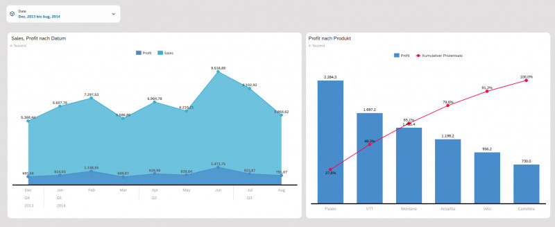
Significance for your business: New chart types such as area charts and Pareto charts allow you to interpret complex data more intuitively, enabling more accurate capacity analyses, sales trends, and more effective prioritization of measures in your company.
3. Seamless integration: Live connectivity to Snowflake
Technical connectivity has been enhanced with the new live data connection to Snowflake. The key advantage for companies is that data no longer needs to be replicated between systems, which is a time-consuming process. SAC accesses Snowflake directly in real time. This guarantees maximum performance when analyzing huge amounts of data, while data sovereignty and security governance remain in the source cloud at all times.
Significance for your business: The real-time data connection to Snowflake ensures maximum performance when analyzing large amounts of data while also securing data sovereignty, enabling you to make informed decisions based on the latest information.
4. Proactive KPI tracking: The evolution of “My Metrics”
After the “My Metrics” feature was introduced at the end of 2025 as a personal monitoring tool, the Q1 2026 update now takes the step towards an active notification center.
Whereas metrics previously had to be called up manually, SAC now offers an intelligent subscription model. Users can now specify precisely whether they want to receive updates on their key figures daily, weekly, or monthly. These reports can also be shared seamlessly with teams and are delivered either by email or directly via the internal notification center.
This transforms SAC from a pure analysis tool into a proactive business assistant.
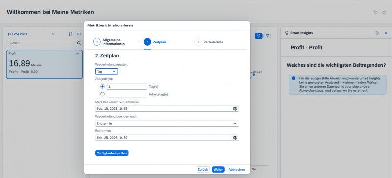
What this means for your business: Your SAP Analytics Cloud becomes a proactive business assistant that automatically delivers relevant KPIs to the right teams, significantly improving responsiveness and the quality of your business decisions.
5. Central governance: The new comment management dashboard
To better manage collaboration within reports, SAP is introducing a central dashboard for managing comments. For the first time, administrators will have a comprehensive overview of all communication threads as well as data point and dimension comments. The new bulk functions are particularly valuable in practice: comments can now be efficiently moved, copied, or deleted across entire model or version levels. This makes it easier to comply with compliance requirements and guarantees a clean, professional reporting environment.
What this means for your business: This dashboard enhances collaboration and compliance within your organization by enabling administrators to centrally control and bulk manage comments, ensuring a clean and professional reporting environment.
Fazit
The Q1 2026 update to SAP Analytics Cloud shows consistent further development toward administrative efficiency and improved user autonomy. While story versioning and central comment management primarily strengthen governance and structure within the platform, the enhancements to live connections and automated metrics offer measurable added value for operational activities. Overall, these innovations from SAP are not purely cosmetic corrections, but functional tools that reduce manual maintenance effort and increase the reliability of data analysis in a business context.
